

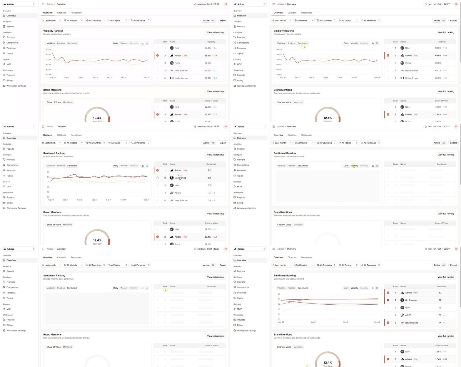
Dashboard Filters
Use the filters at the top of the page to focus your analysis:- Date range: Select the period you want to analyze.
- Models: Compare all AI models or select a specific platform.
- Countries: Focus on responses generated for selected countries.
- Topics: Analyze specific groups of prompts.
- Personas: See how performance differs between audiences.
- Active / All: Include only active prompts or all available prompts. When All is activated, all prompts that are active and all archived prompts from the past will be included.
Visibility Ranking
The Visibility Ranking compares how frequently your brand and competitors appear in AI-generated responses. The chart shows how performance changes over time, while the ranking shows the current results for each brand. You can switch between:- Visibility: How often each brand appears.
- Position: Where each brand appears within responses.
- Sentiment: How positively or negatively each brand is described.
Brand Mentions
Brand Mentions shows how attention is distributed between your brand and its competitors. Switch between:- Share of Voice: Your brand’s share of all tracked brand mentions.
- Mentions: The total number of times each brand appears.
Position Segments
Position Segments show where your brand appears within AI-generated responses. Palagus measures Position from 0 to 10:- 10 represents the beginning of the response.
- 0 represents the end of the response.
- Top
- Middle
- Bottom
Sentiment Segments
Sentiment Segments show how AI models describe your brand. Responses are grouped into:- Good
- Neutral
- Negative
Model Visibility
Model Visibility compares your brand’s Visibility across the monitored AI platforms. Use this section to identify:- Which models mention your brand most frequently
- Where your brand performs below average
- Whether your Visibility is consistent across platforms
Topic Visibility
Topic Visibility shows which topics generate the strongest presence for your brand. Use this breakdown to discover:- Topics strongly associated with your brand
- Areas where your brand has limited Visibility
- Topics that require deeper prompt analysis
- Opportunities to improve your content or positioning
Persona Visibility
Persona Visibility shows how frequently your brand appears for different audiences. A brand may perform strongly for one persona but remain less visible for another. Use this section to identify:- Audiences where your brand is already established
- Personas with weaker brand presence
- Audience-specific content opportunities
- Differences in competitive performance
Understanding Changes
The arrows next to a value show how the result changed compared with the previous comparable period.- An upward arrow indicates an increase.
- A downward arrow indicates a decrease.
- The number shows the size of the change.